
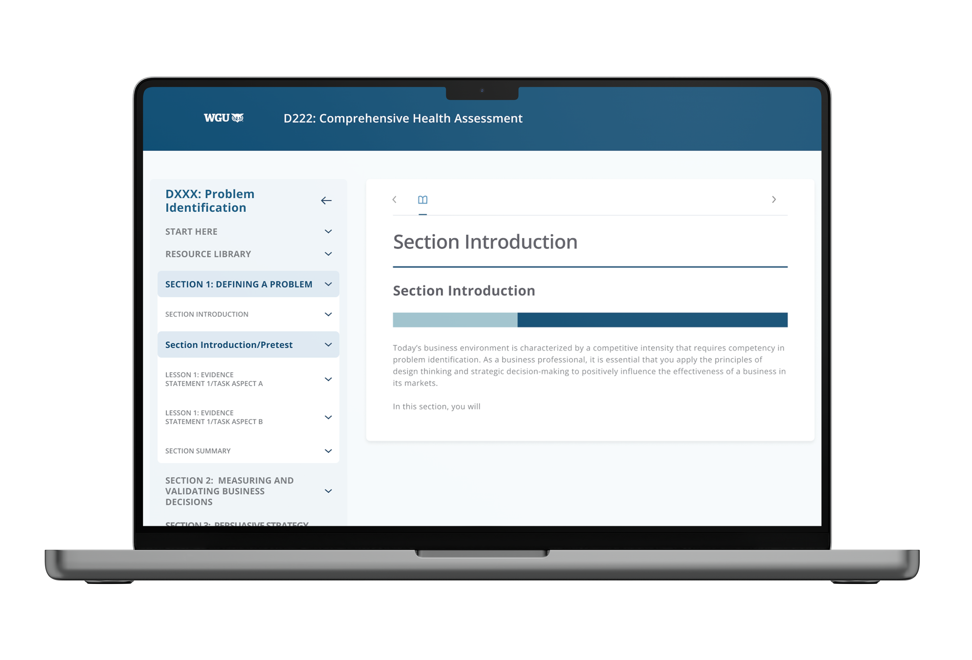
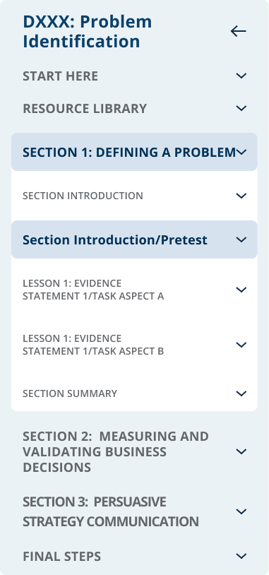
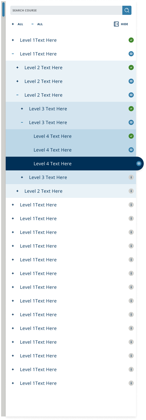
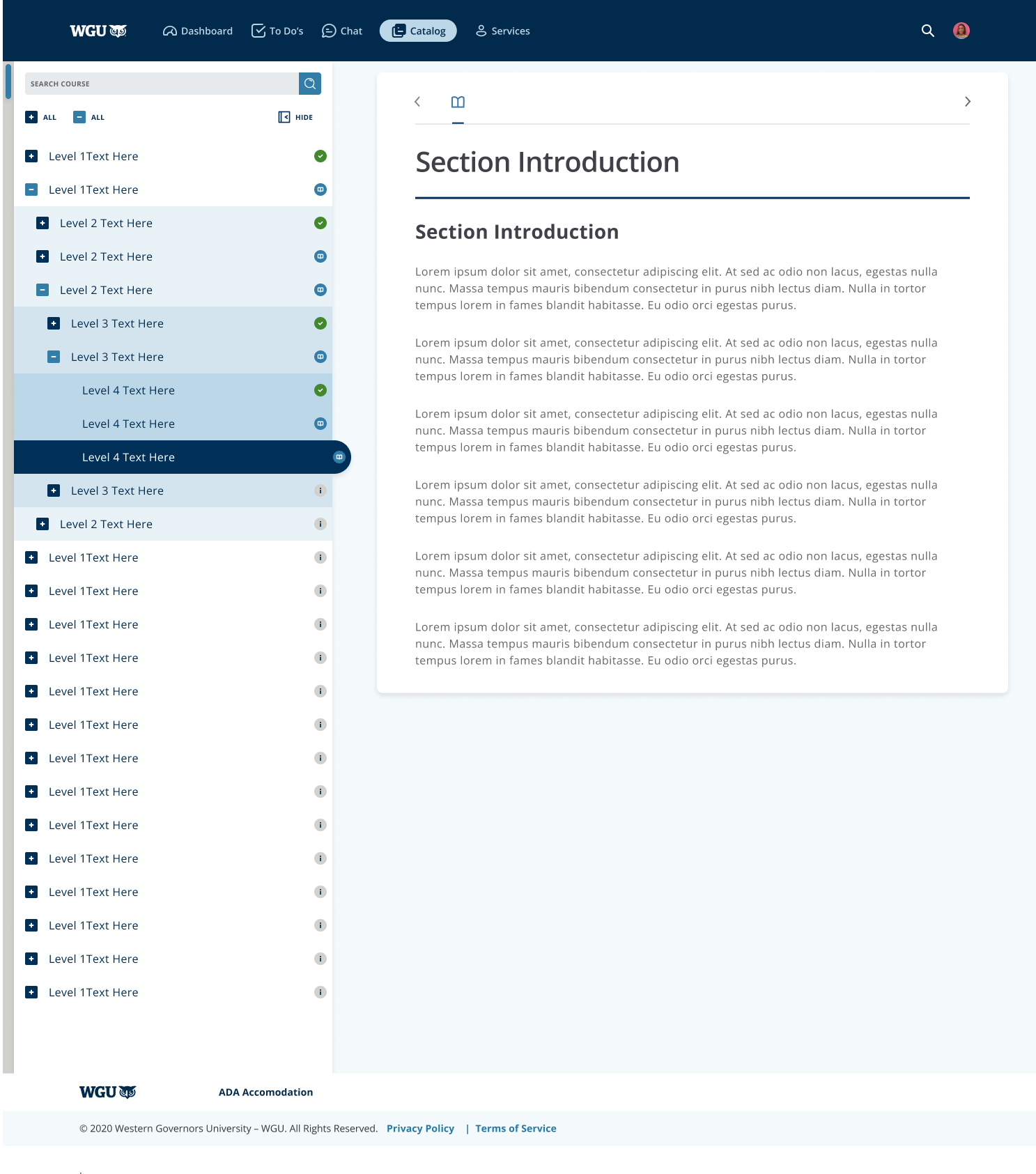
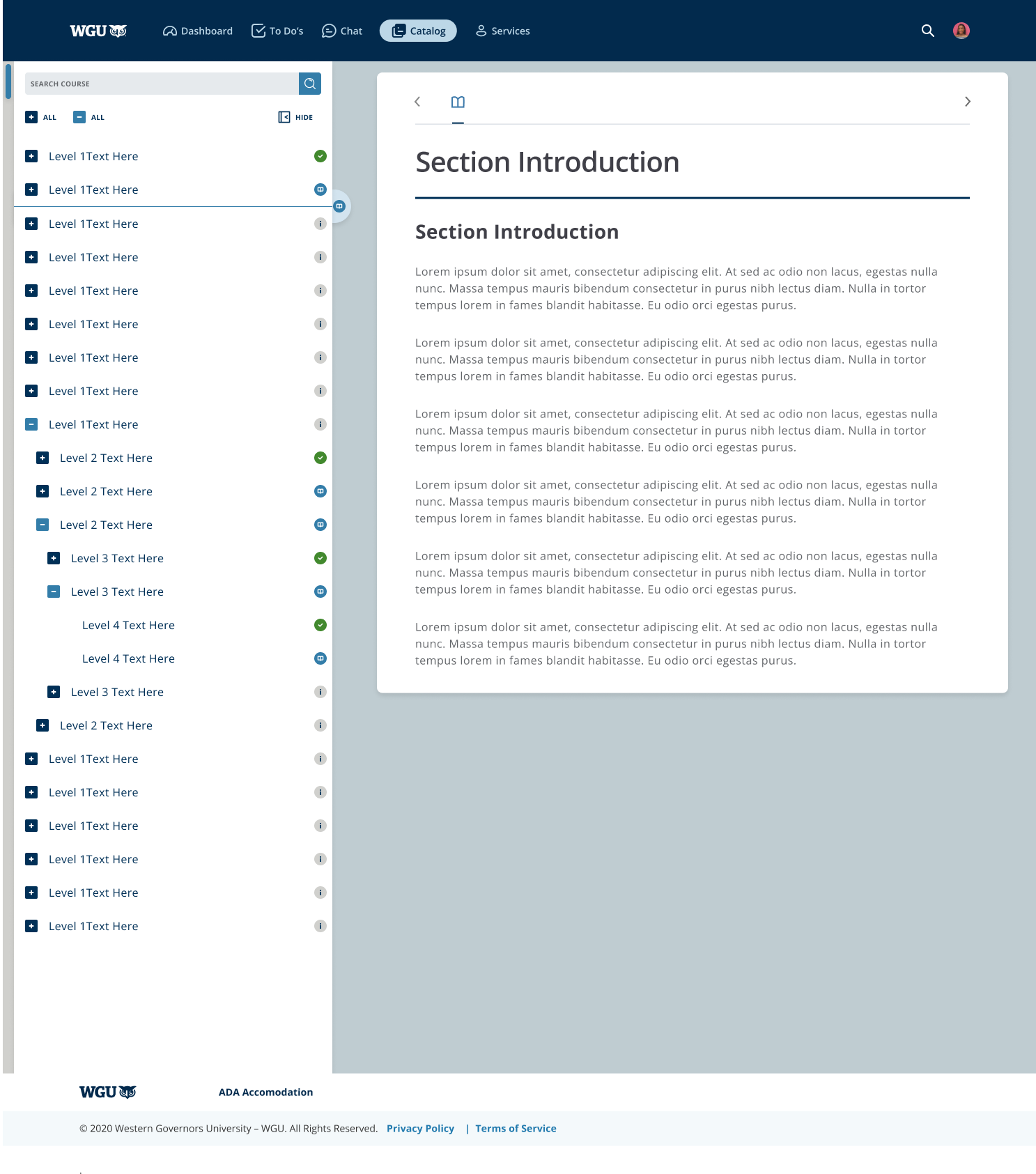
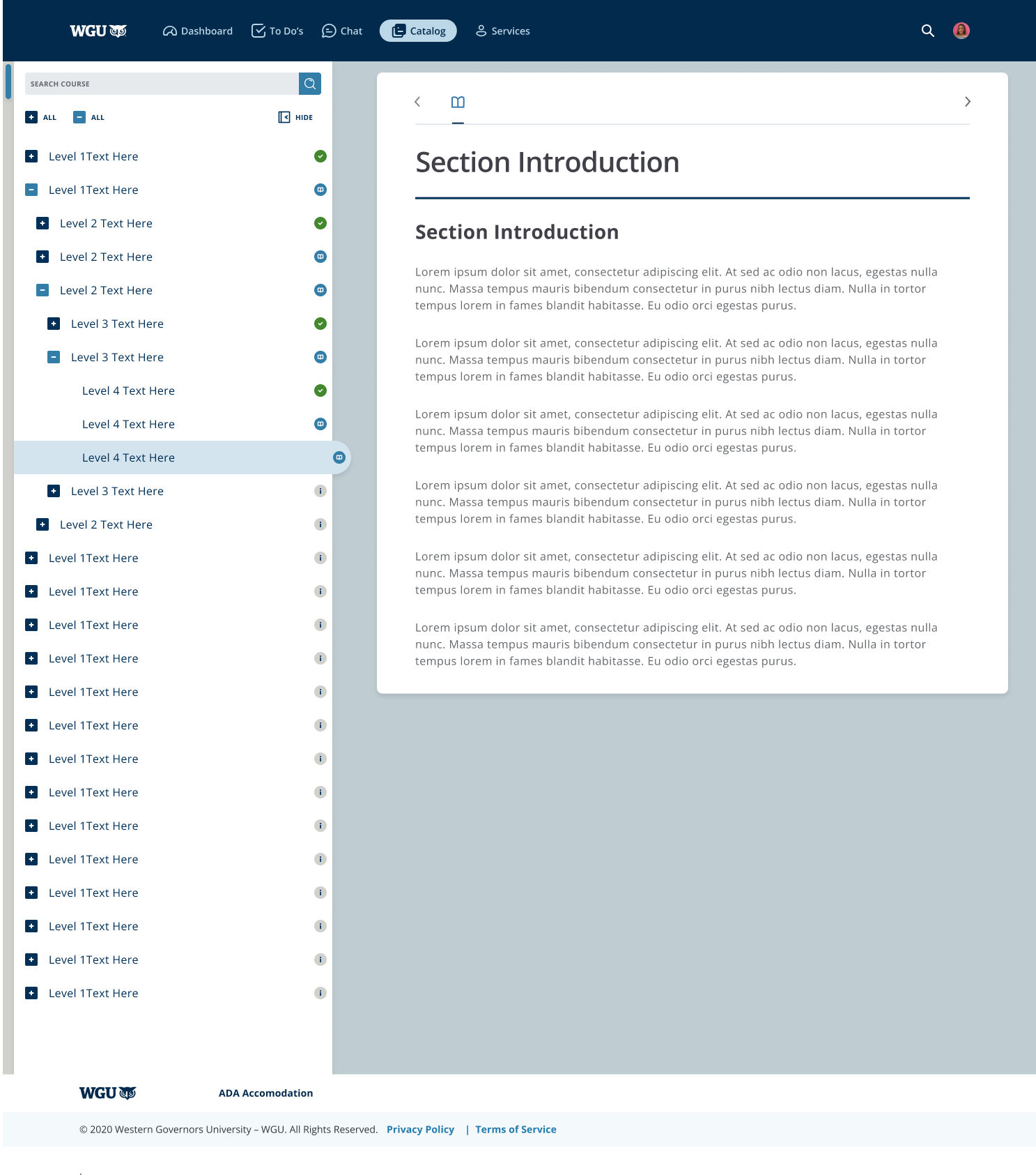
Previous Side Menu
The current menu has many issues that needed to be addressed.
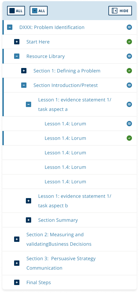
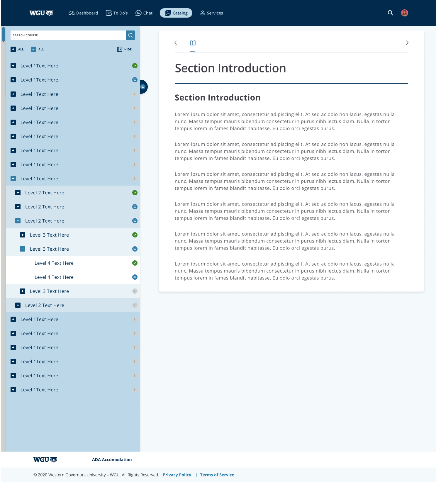
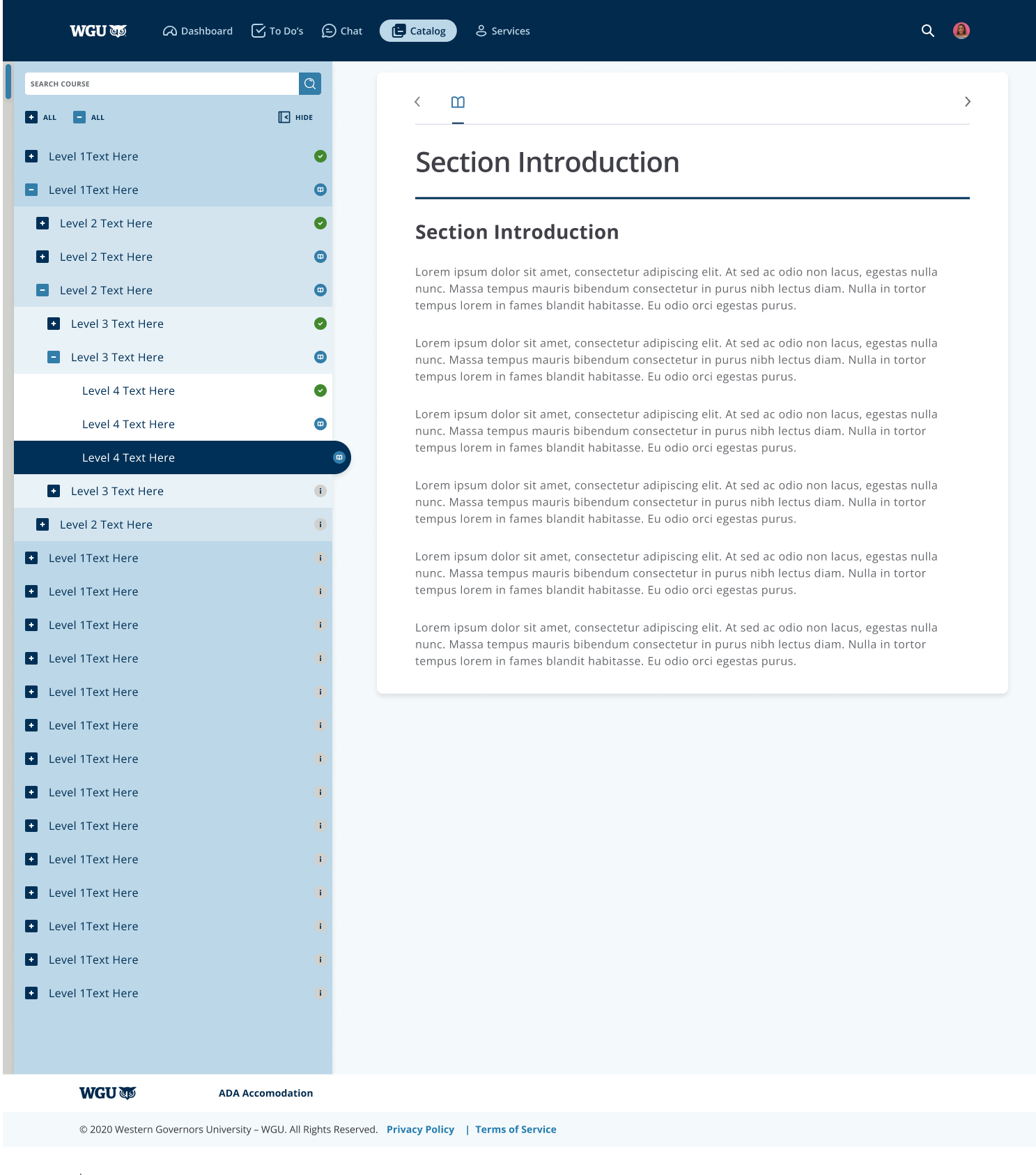
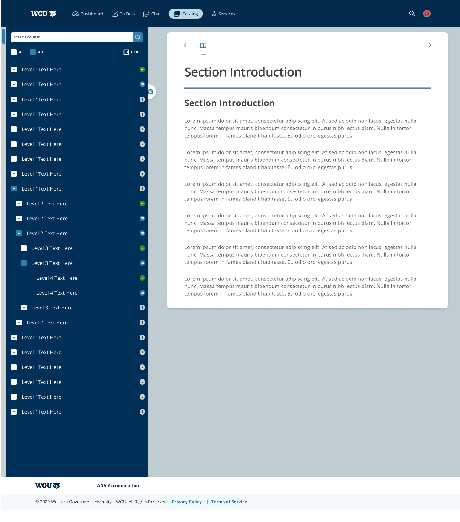
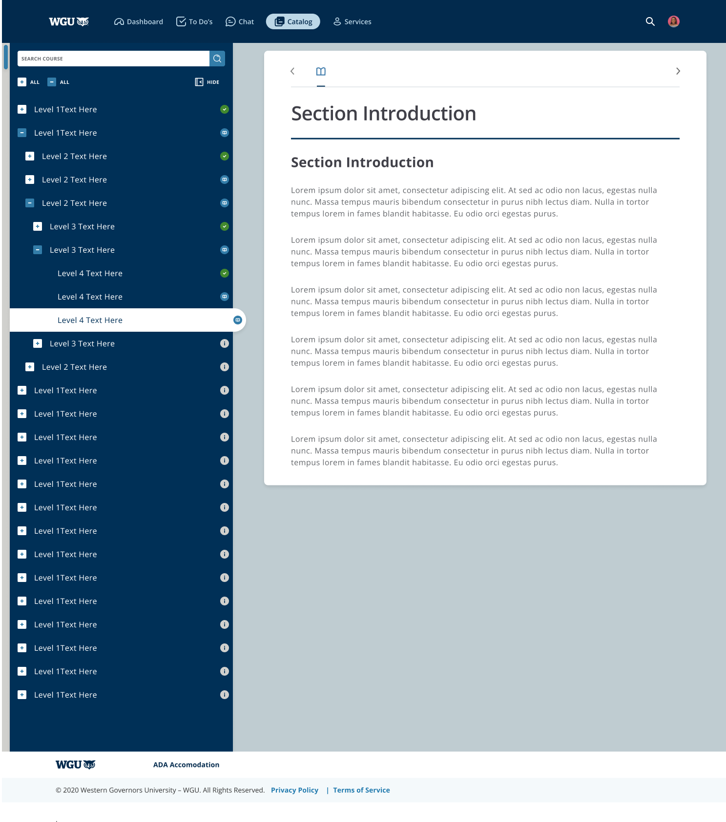
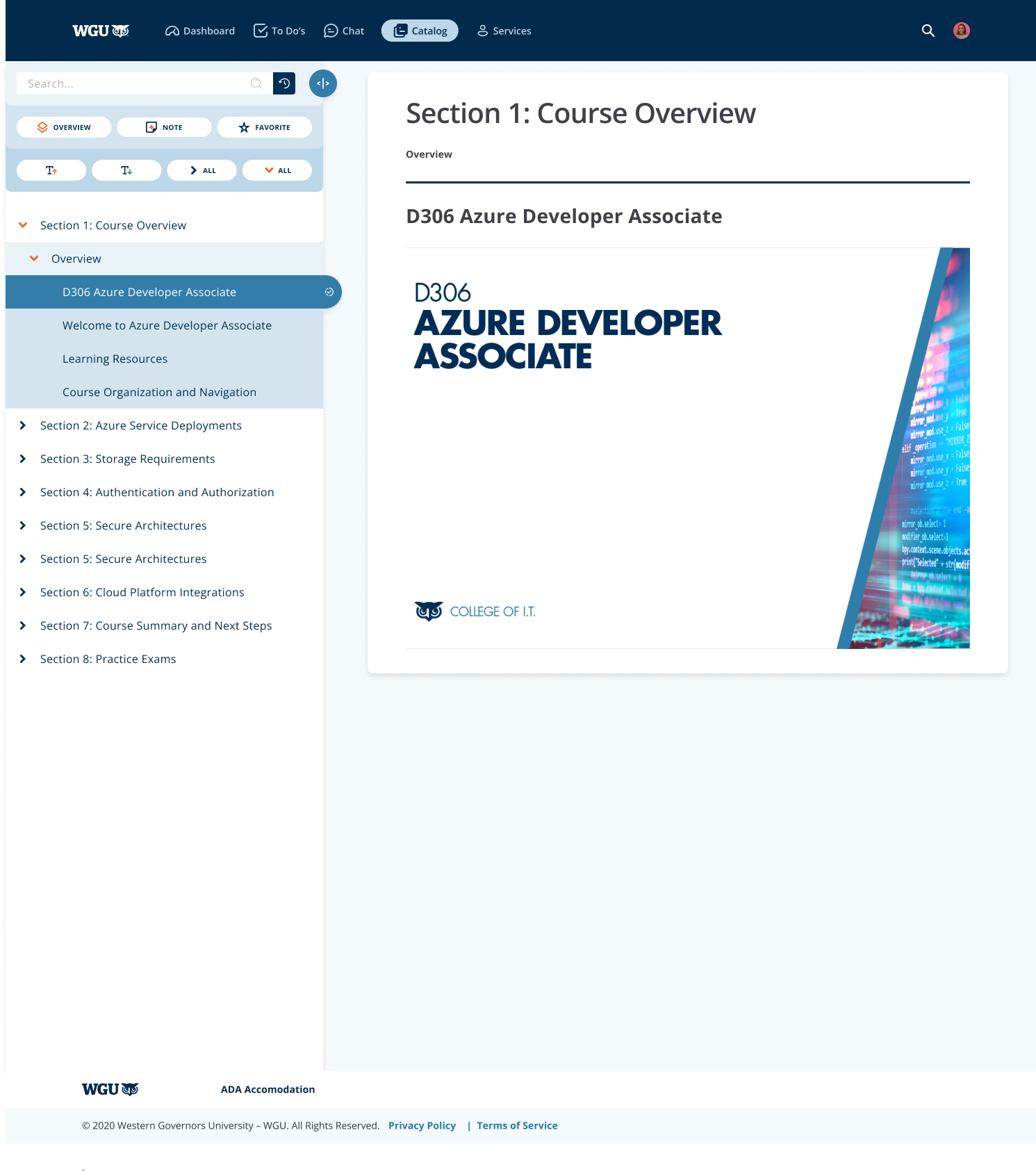
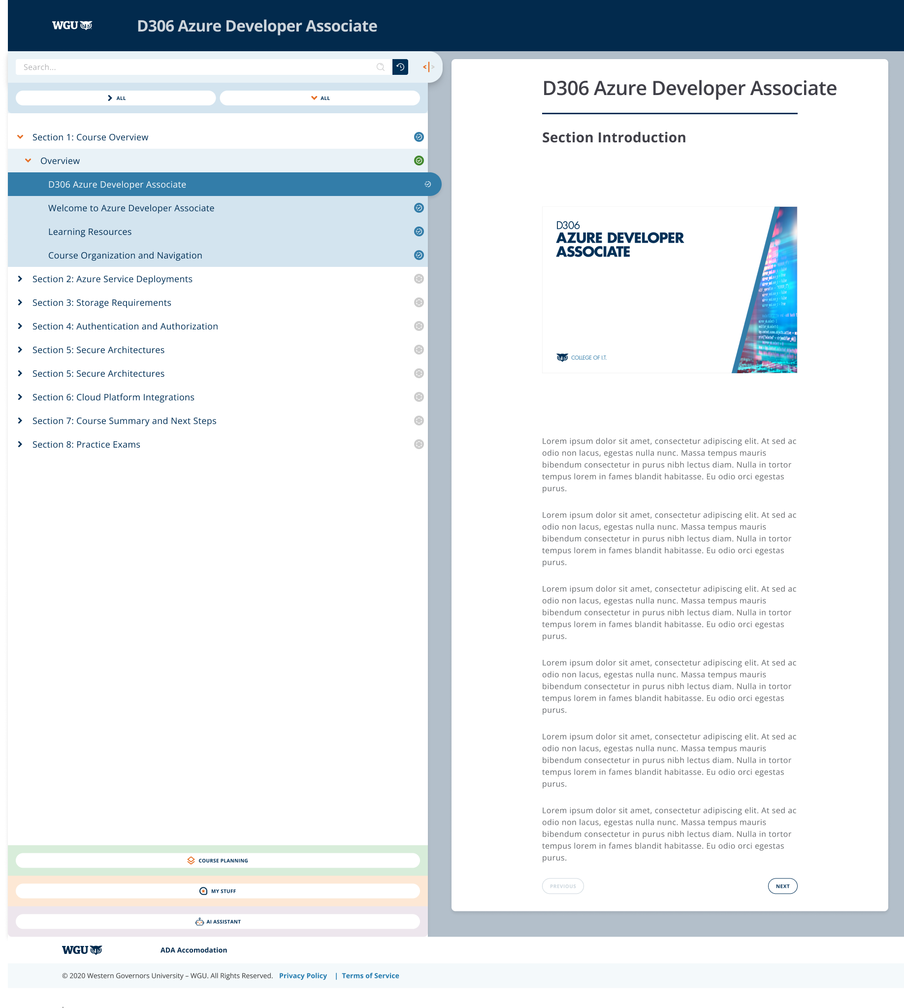
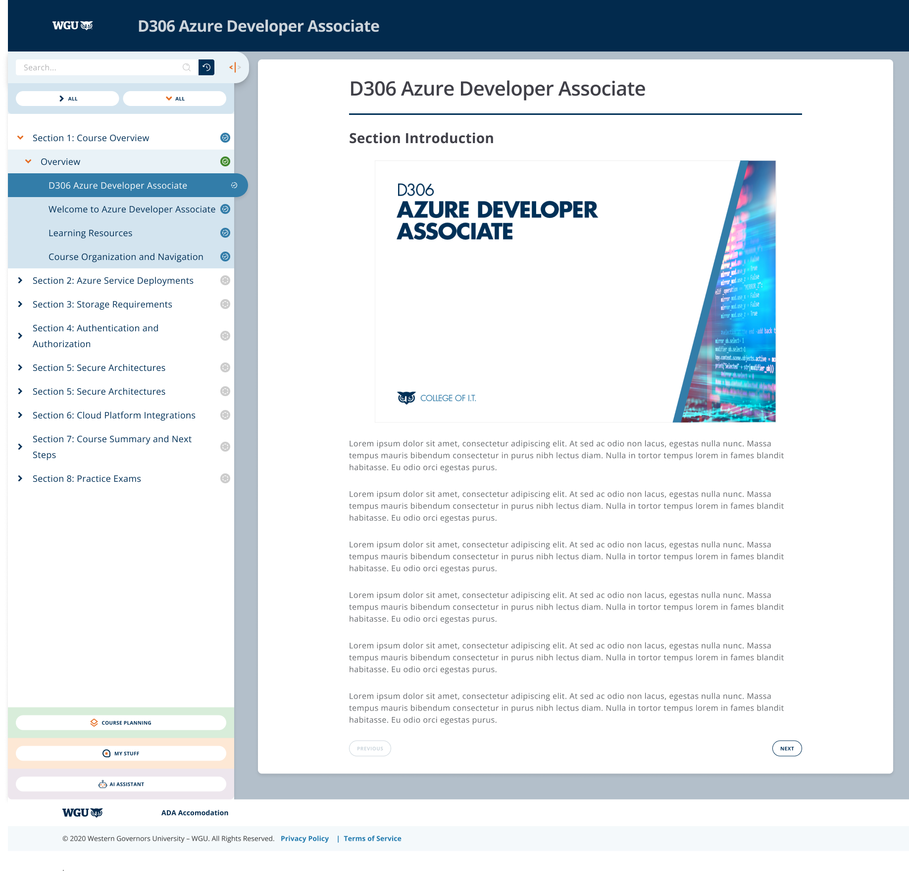
The currently active page (section introduction) has the same color treatment as the open section that contains it (SECTION 1: DEFINING A PROBLEM).
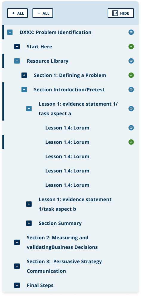
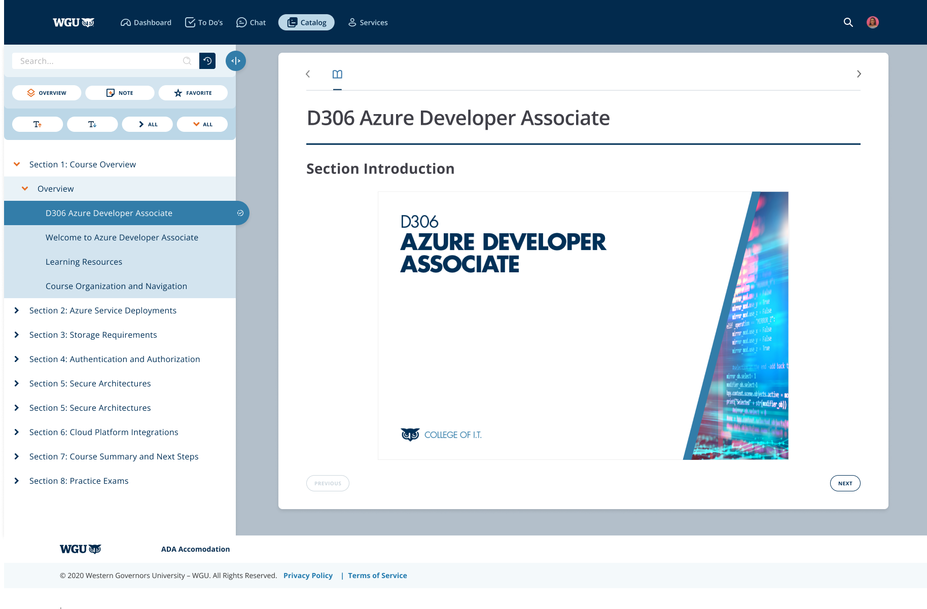
Hiding the menu is done using the arrow pointing left in the top right of the menu area (next to DXXX: Problem Identification). Users indicated that it looked more like a back navigation button than a hide menu button.
The typographic hierarchy and spacing could use some more consistency, there is a mixture of casing, color and sizing changes.
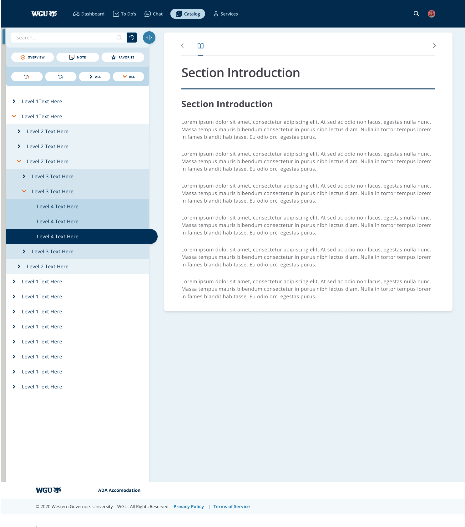
There are actually TWO menu's on display here. OEX natively uses the horizontal menu above "section introduction" on the body of the page. Consolidating these menus would be preferable, and research showed that the left hand navigation was far more widely used.
The features team (my team) has been tasked with bringing additional features to the students to use in OEX. The new design should make sure to support these features (search, AI chat, note-taking, course planning etc).
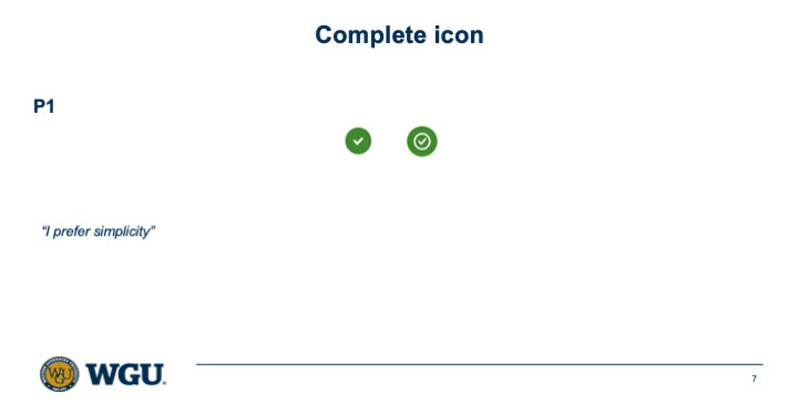
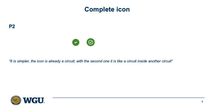
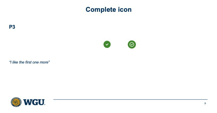
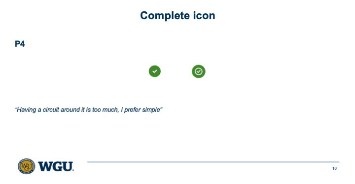
Phase 1


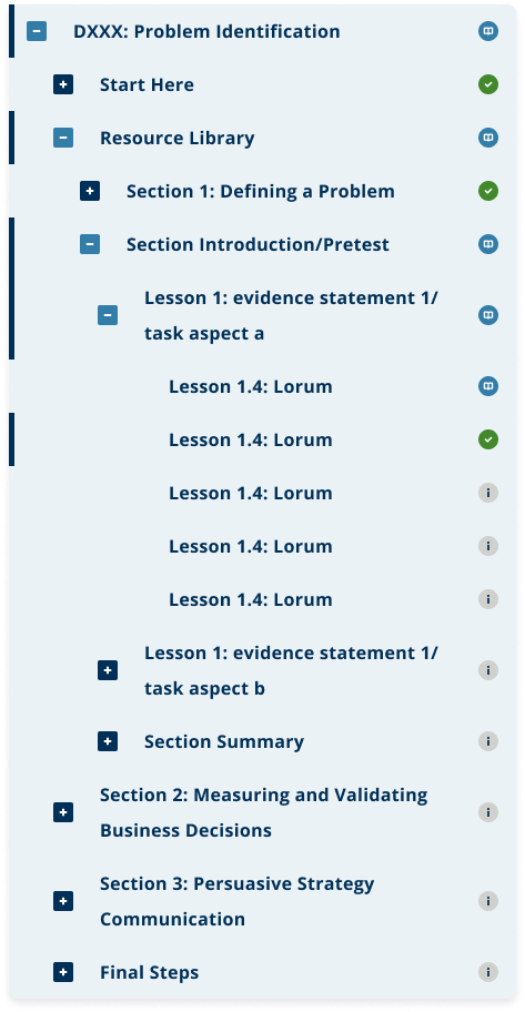
Initial menu iterations


Initial design feedback to inform design direction.

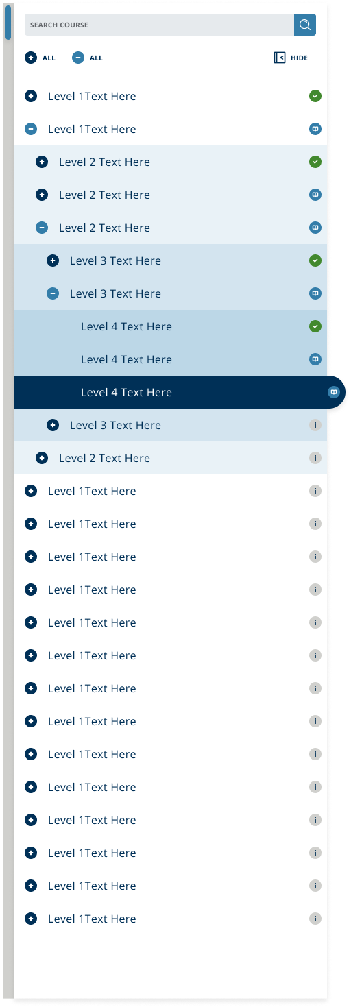

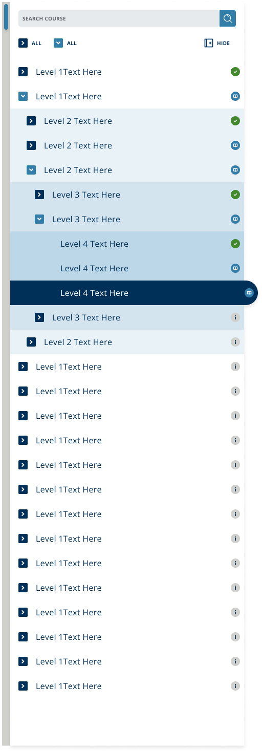
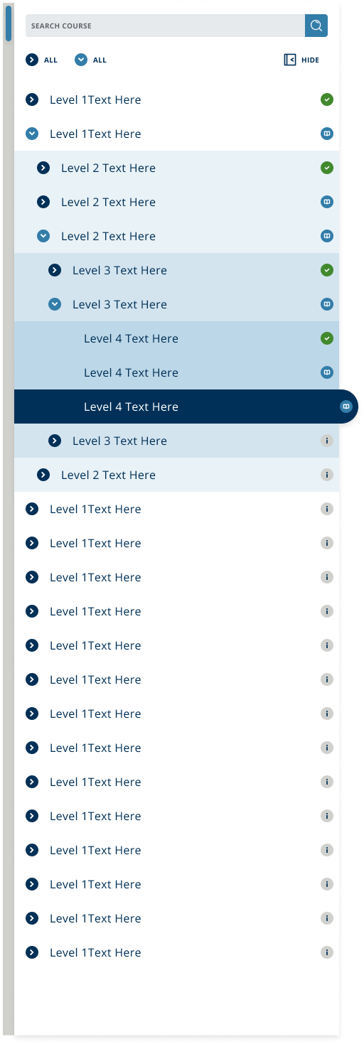
Menu options for item expand/collapse button testing.
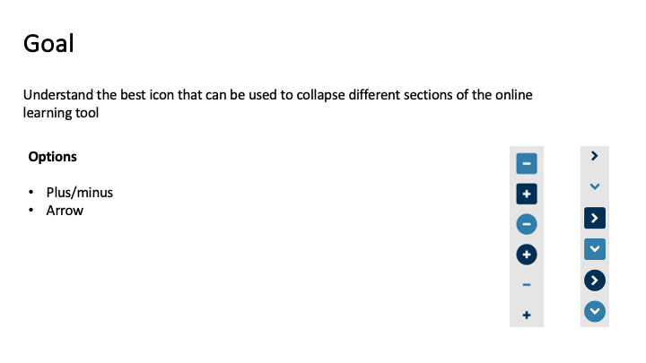
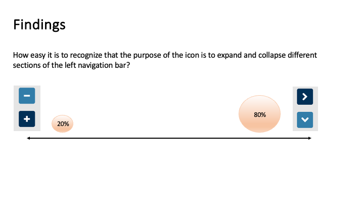
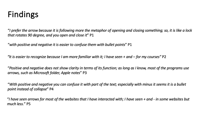
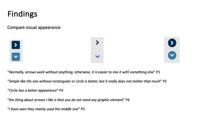
User testing for button preferences. Results showed the use of arrows/chevrons < > ^ v without a closed boundary was preferable vs + and - buttons, or traditional colored buttons.

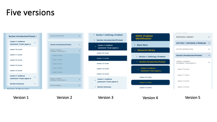
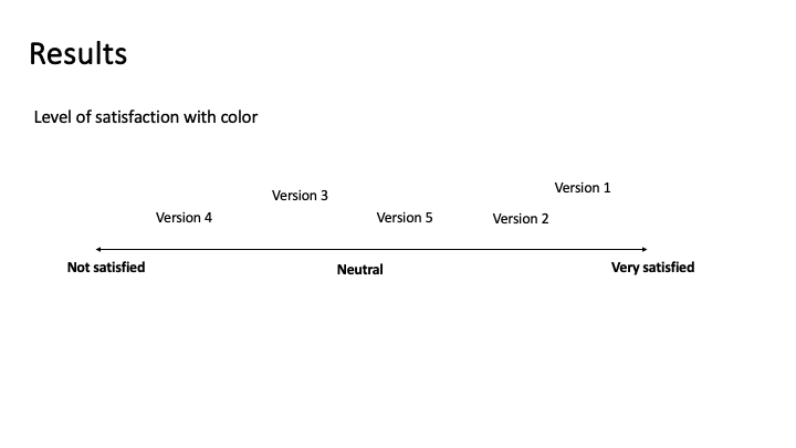
Color testing. Menu single colors vs colors indicating different tiers + different background colors.
Phase 2


Phase 2 was used to iteratively improve the design based on user feedback and testing, incorporating ideas for features and testing different menu states such as expanded, collapsed, resized etc.
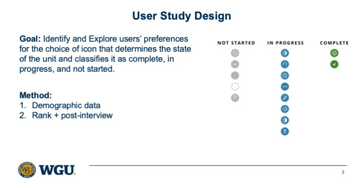
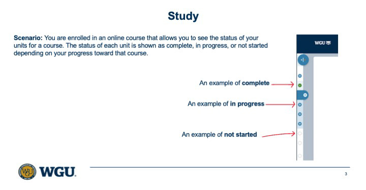
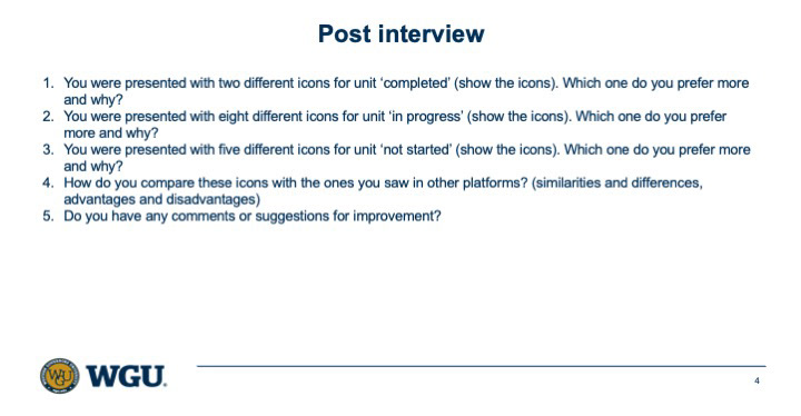
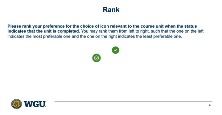
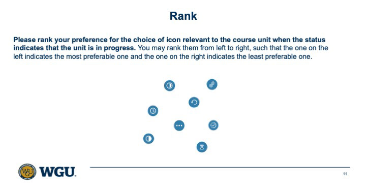
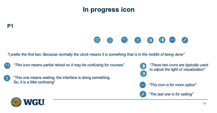
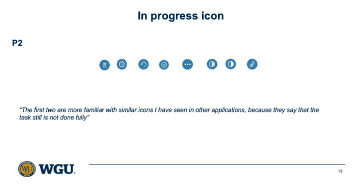
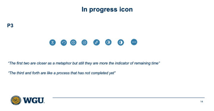
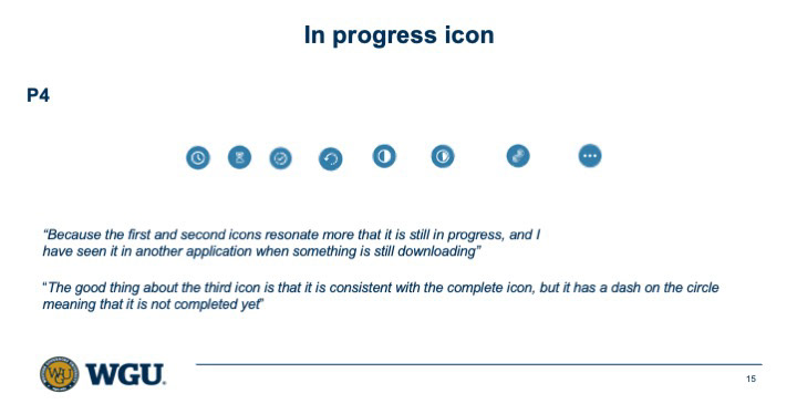
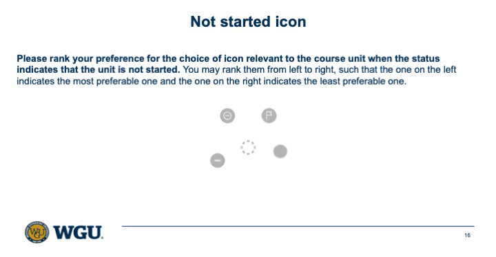
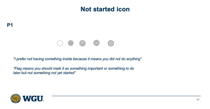
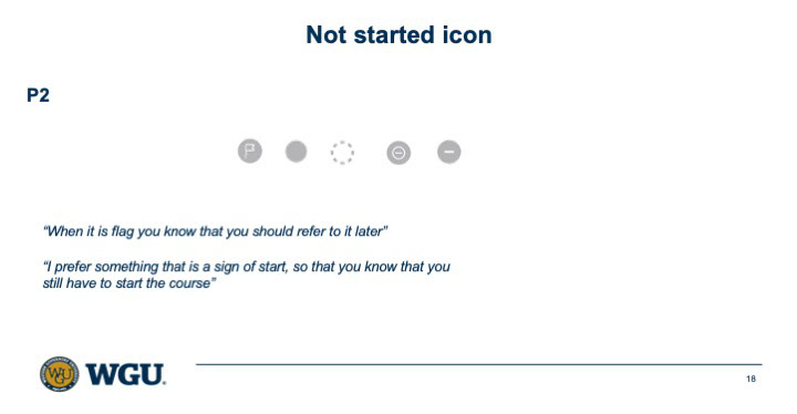
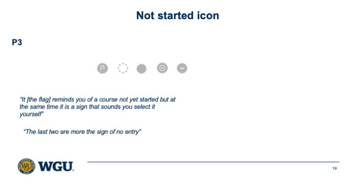
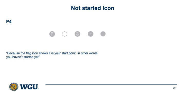
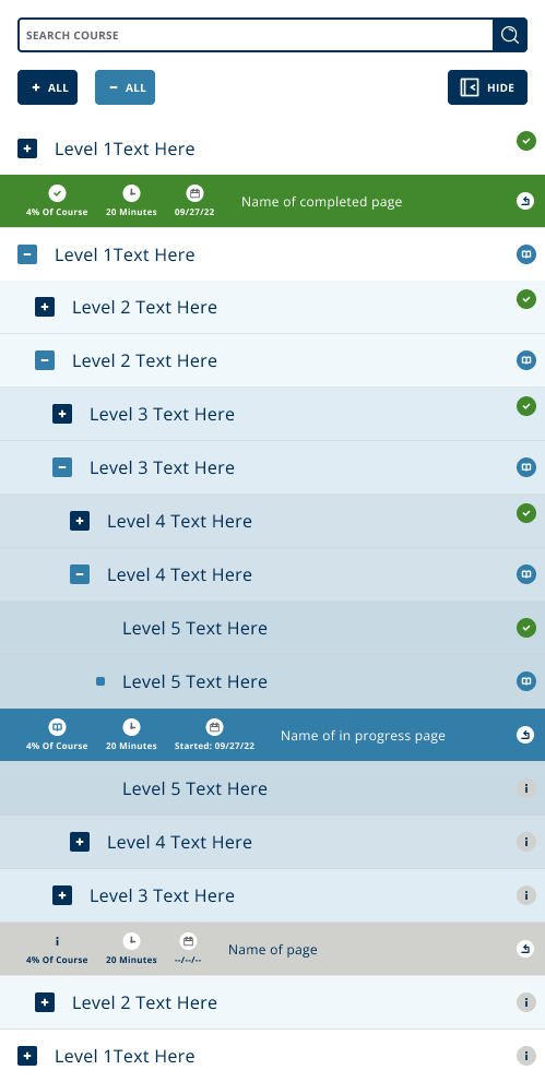
Research on progress indicator icons for minimized/collapsed menu