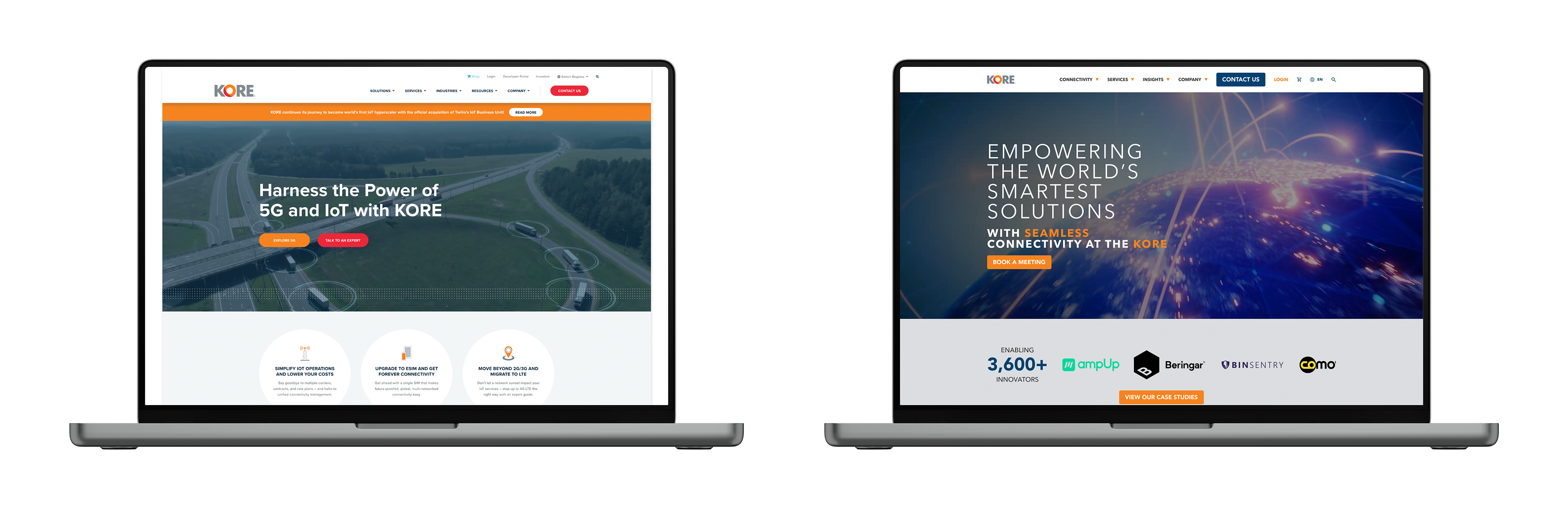
KORE
Problems:
The original site was built on a HubSpot template, which made sense at the time, but over the years, the benefits of that setup were slowly eaten away. The site had become bloated, hard to manage, and boxed in by the limitations of the template. Visually, it was starting to feel dated. Internally, it was getting harder to keep things clean and consistent. The ask was simple on paper but big in scope: rebuild the site on a new platform that offered more flexibility, stronger security, and a better editing experience, while cleaning up the visual style and giving it all a much-needed polish.
Solutions:
I recommended a shift to WordPress—something with the scale and flexibility to support a large corporate site, but still intuitive enough for the internal team to manage without headaches. Working closely with the project stakeholder, we iterated early and often—building not just the case for a revamp, but also the foundations of a new visual language and a clearer way to speak to KORE’s core personas.
Visually, my main goal was to leave behind the flat, dated feel of the old site and lean into a sharper, more modern tech aesthetic. I introduced a visual system anchored around KORE’s “O” as a recurring icon motif—giving us a unique visual throughline across pages. I also began incorporating AI-generated assets into the site design, which helped KORE break free from the recycled stock imagery that plagues so many IoT competitors (a good AI use case). The result felt fresher, more bespoke, and more aligned with how the client wanted to present themselves: future-facing and capable.
This was a big overhaul, and we pulled it off without breaking anything important, which is exactly how it should go.
Smooth SEO Transition: Keyword rankings dipped briefly (as expected) but rebounded quickly and outperformed the old site.
Stable Traffic: No post-launch drop. Early signs of growth suggest the content and structure changes were right on the money.
Improved Visibility: Keyword rankings improved across the board, with stronger performance in both the top 10 and top 100.
Strategic UX + Content: The cleaner structure and tighter messaging didn’t just look better—they delivered stronger discoverability and user flow.
The metrics told the story: no disruption, stronger rankings, and real momentum moving forward.
OEX Menu - WIP
Problems:
The current menu has many issues. The use of color and text makes it difficult to understand how to drill into the menu. In the "before" image the user is currently in the "section introduction/pretest" page, but it has the same look as the "section 1: defining a problem" making it confusing to look at.
The "hide" button (the left arrow) in the menu is unclear, and hiding the menu only gives a small amount of extra room to the user.
Solutions:
We addressed the hierarchy issues with a tabbed/indented spacing to show the relationship between pages, as well as delineating each layer by color. The "current" page extends outside of the menu slightly, making it easy to explore the menu while returning easily to the page the user is on by selecting the tab. We implemented a search feature with a search history button, made the hide menu button clearer and left room for the development of further features to help improve user experience such as a course overview page, sticky note and the ability to favorite pages. We slightly darkened the background to better delineate it from the main page and menu.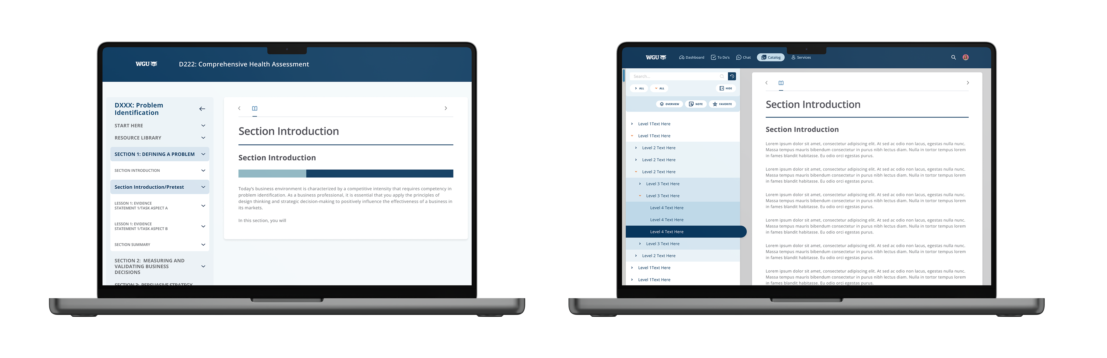
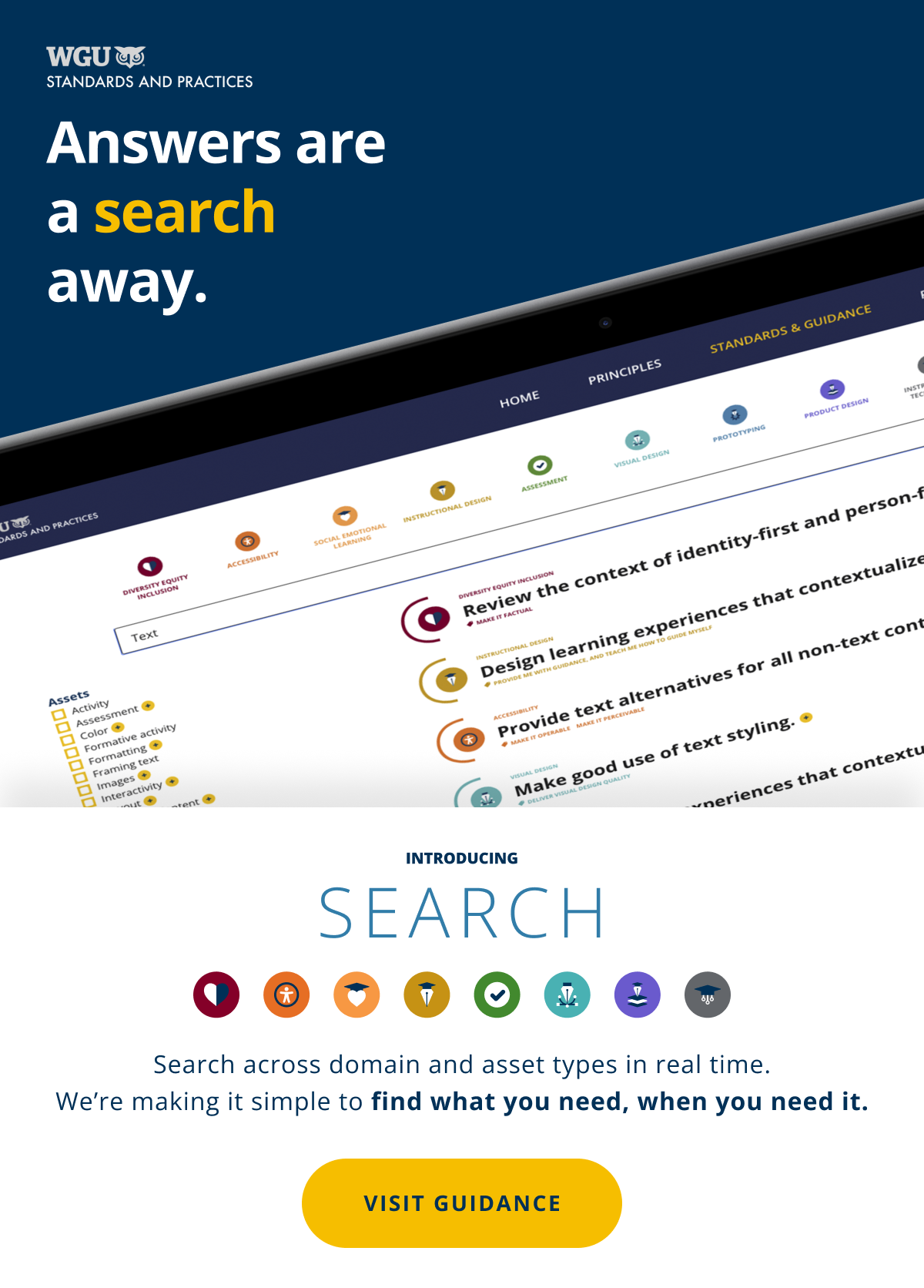
OEX Search - WIP
Problems:
Search has been a feature requested by students for a long time, implementation is largely dependent on developer and system capabilities. We're building this feature from the ground up and don't want to go too far into the weeds, or stray too far from an MVP.
Solutions:
We sorted the results of a search by relevancy from current pages in the course the user is working in, working out to the section level, then Course and finally Program level results. We added a similar/related search results to address 0 results returned and an expandable/collapsible result to add detail. Our search history page can be narrowed by date, results themselves can be searched for key words and results can be erased.
WGU Guidance
Brief:
"Guidance" is a site that serves those who are creating educational products of any sort. From design or development programs, assessments, or courses. The guidance site aims to achieve three things:
1) More efficiently create higher quality and more consistent educational products.
2) Adapt educational content to changing markets much faster.
3) Reduce the cost of education by reducing time to market and worker hours per product.
Standards teams traditionally create firm standards that are served up as strict policy, and they place this information into lengthy documents that are copied from team to team.
We aimed to achieve the three stated goals by delivering our Guidance in the form of an interactive, dynamic, searchable site that contains recommendations that require users to make their own decisions.
Role:
UI/UX Development from existing site idea and initial comps to create fully realized interface.
Assist in user testing, creation of prototypes and working mockups.
Assist development and provide assets for implementation in wordpress.
Creation of marketing email graphics.

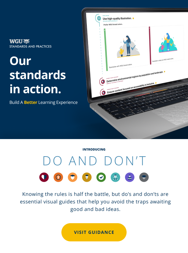
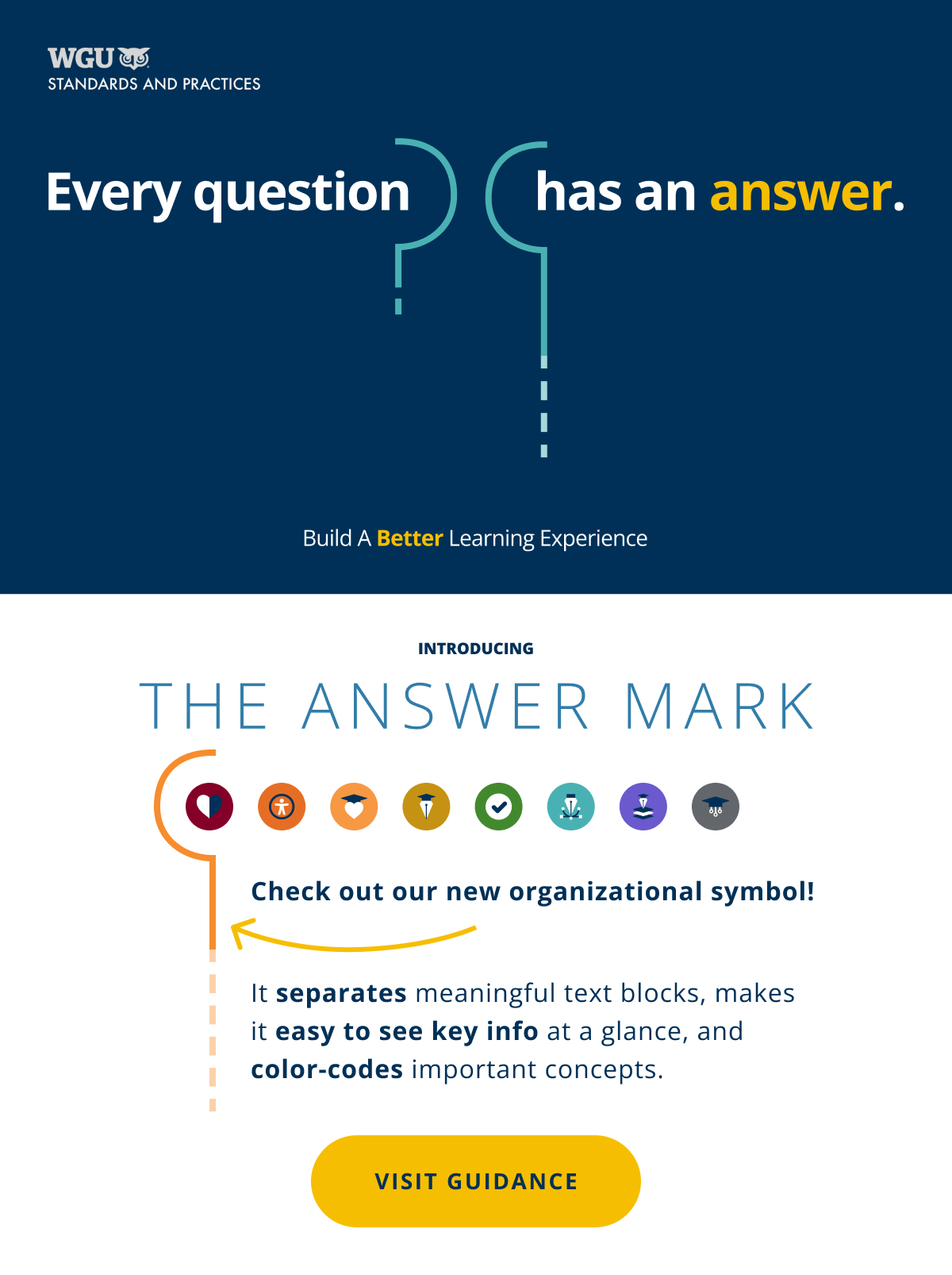
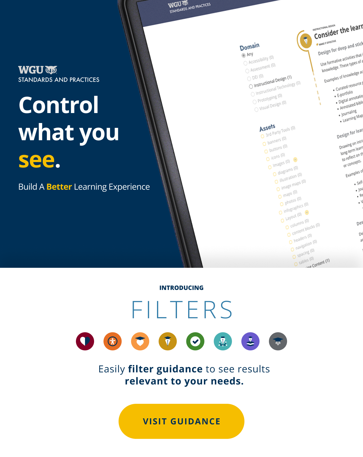
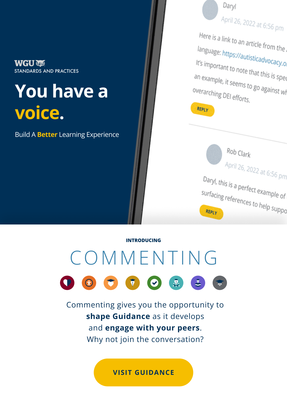
Marketing Emails with features

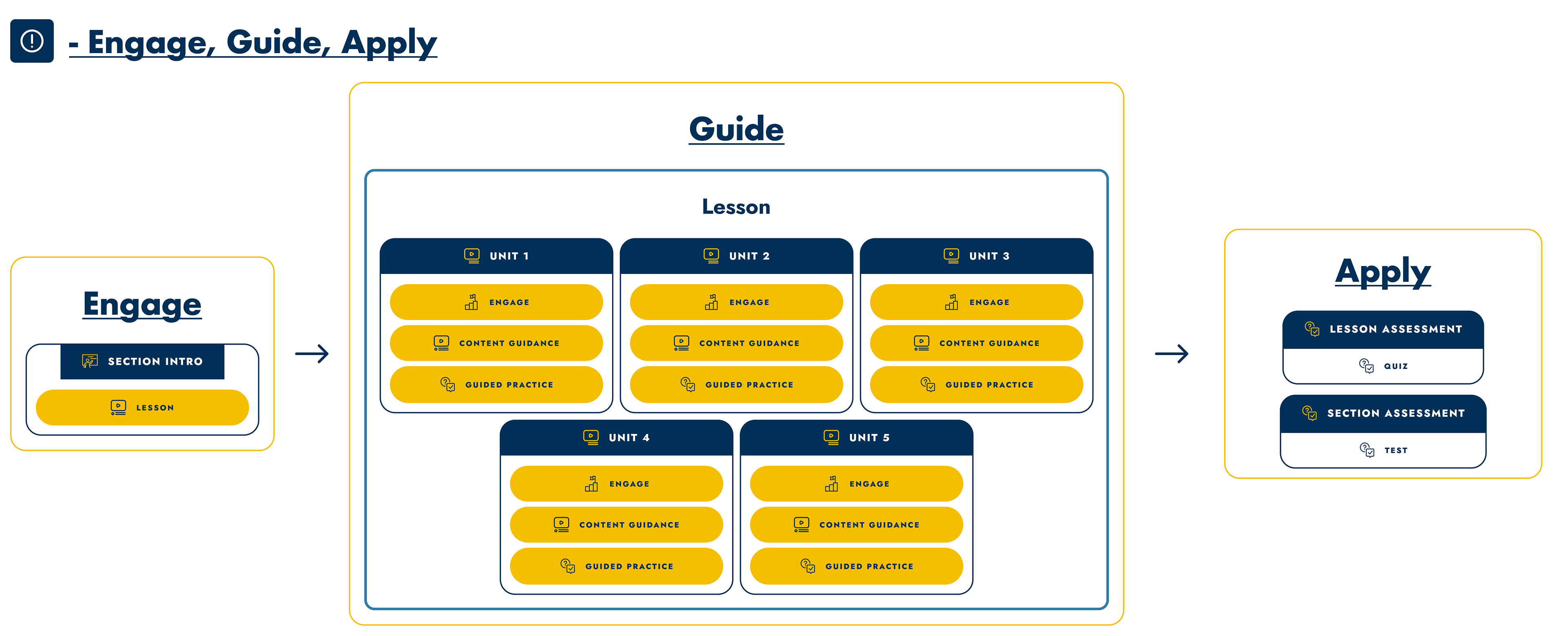
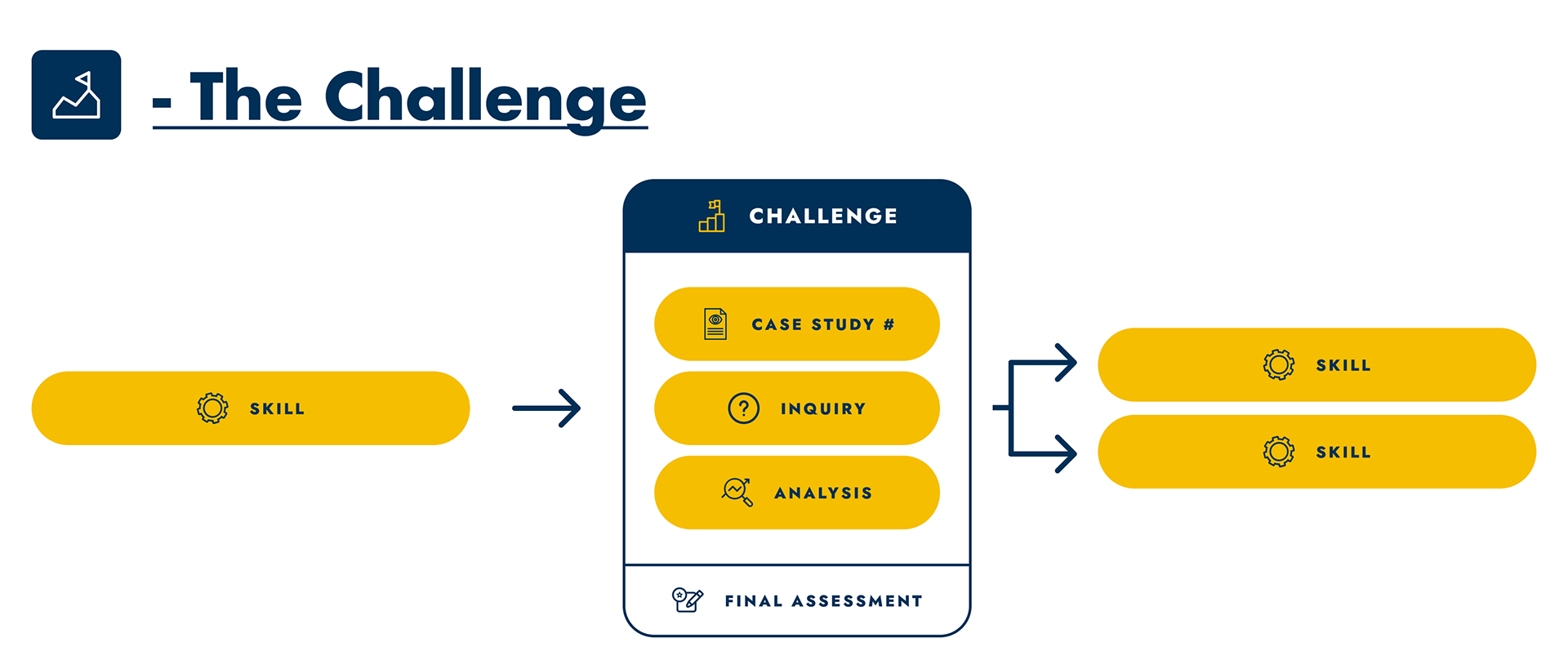
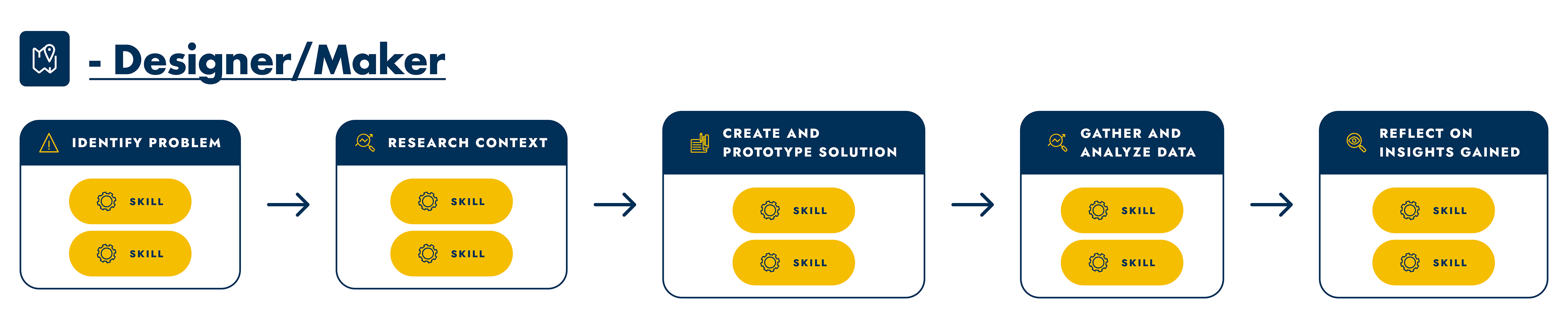
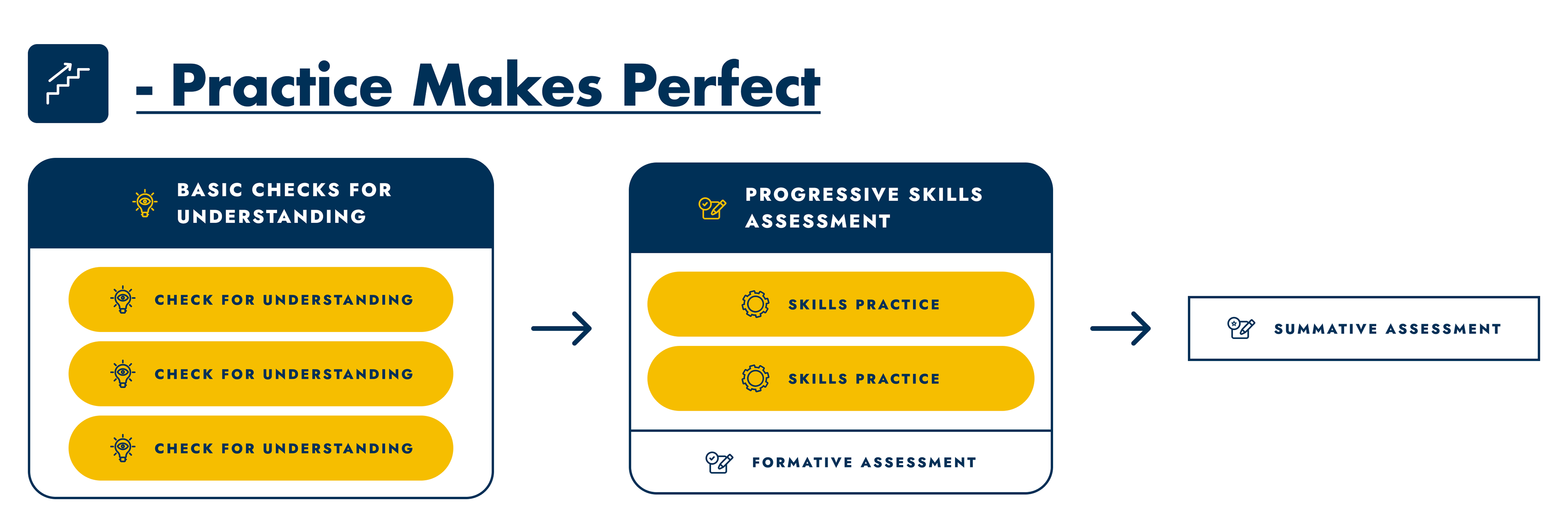
WGU Program/Course Design diagram system
Brief:
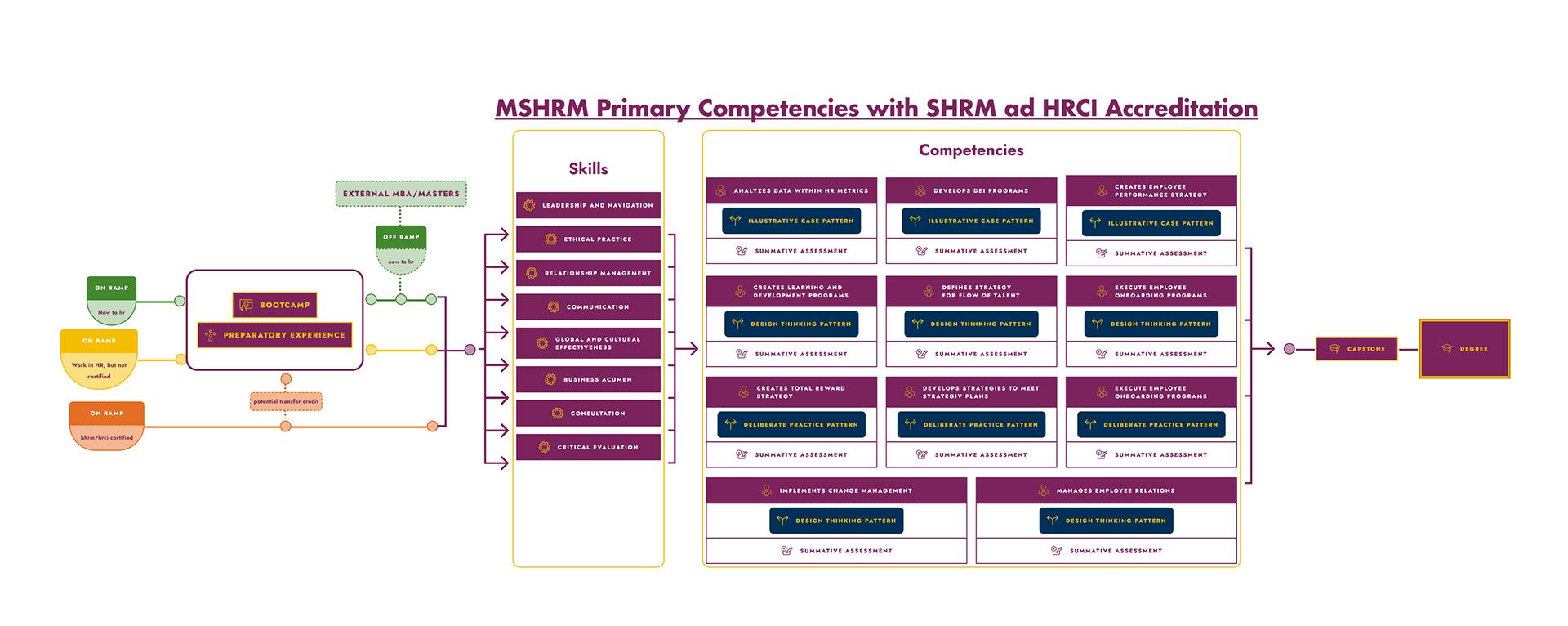
Using Figma, create a library of resources to allow users to put together Program and Course diagrams that are fast, flexible and easy to use.
Result:
Created themed libraries for both Course and Program design containing pre-set options as well as customizable labels and icons that can be dropped into pre-configured and layered frames/containers and linked with a variety of arrows.
Created an interactive course to show Figma basics and how to utilize the libraries to their full potential, as well as guiding Learning Experience Designers in one-on-one sessions and advising them how to get the most from the libraries, as well as Figma.
Libraries

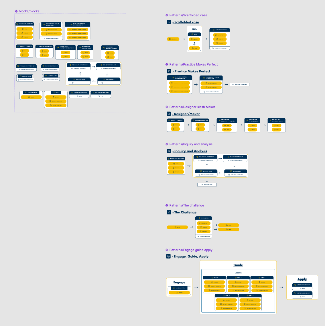

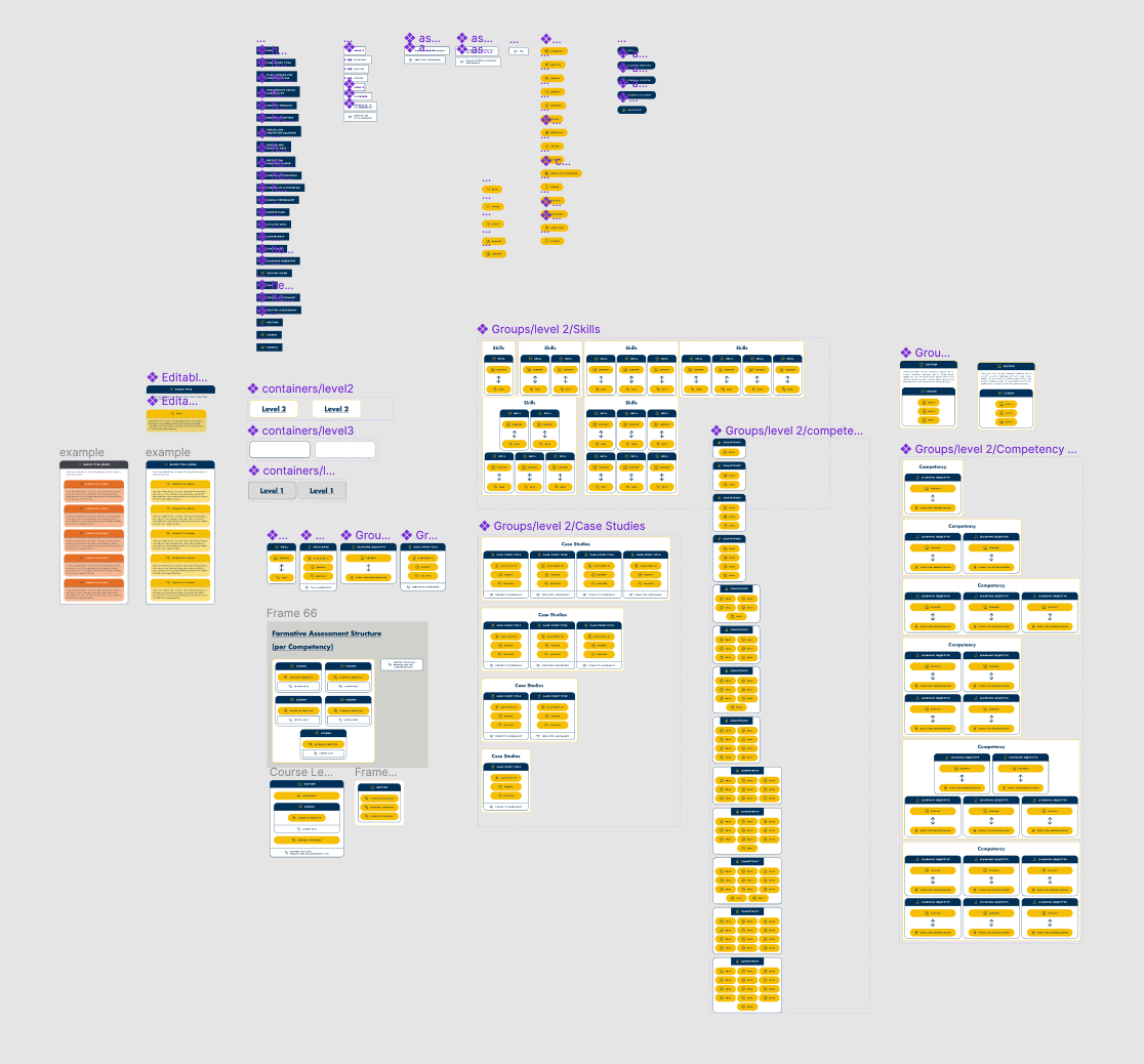
Diagram examples


DMI Automotive Microapp
Brief:
Create an interactive experience to follow up on sales leads generated from the Detroit Automotive Expo
Showcase DMI Automotive products to refresh customers understanding and provide links to whitepapers and a way to get in contact.
Results:
Open rate: 55%
181 views
33 shares
181 views
33 shares
Interactive Wireframe
Final Interactive Microapp
DMI - 2020-2021 Site & Brand refresh
Goals
Clarify our messaging
Promote and lift master brand due to weak brand identity
Incoherent services brands
Must market company, not services
Update branding look and feel to reflect the convergence of physical and digital worlds that feels unique to DMI.
Consistent clear page structure reflecting new and improved intake documents.
Showcase relevant achievements and statistics on each page to prime users.
What do we want people to think and feel about DMI
Want DMI to feel cohesive, and like a single brand
What challenges and problems do we need to overcome
Clarifying messaging
What is the DMI master brand message?
Intelligent Digital Transformation
Scope:
New Homepage and Site Navigation,
31 New Service Offering Webpages,
3 New Partner Pages,
6 Industry Pages,
4 Industry Solution pages
all-new Federal, and State and Local Pages
31 New Service Offering Webpages,
3 New Partner Pages,
6 Industry Pages,
4 Industry Solution pages
all-new Federal, and State and Local Pages
Results:
157 marketing generated meetings booked YTD, with a total opportunity value of $32.7M, and 5 new logos
24% increase in organic search impressions
301 new contacts created
Desktop rankings improved 347 positions compared to baseline
Mobile ranking improved 299 positions compared to baseline
86 Inbound leads generated from our site, content, SEO, CTAs.
76 targeted outbound campaigns run in house resulting in 71 meetings booked
Ranking on page 1 for the search term Digital Transformation Services
Ranking on page 1 for Device Lifecycle Services, Managed Mobility Services, Managed Mobility, ServiceNow Services
Ranking on page 1 for Connected Vehicle Strategy
Imagery Examples (convergence)


Web Page Designs


Chatbot Design


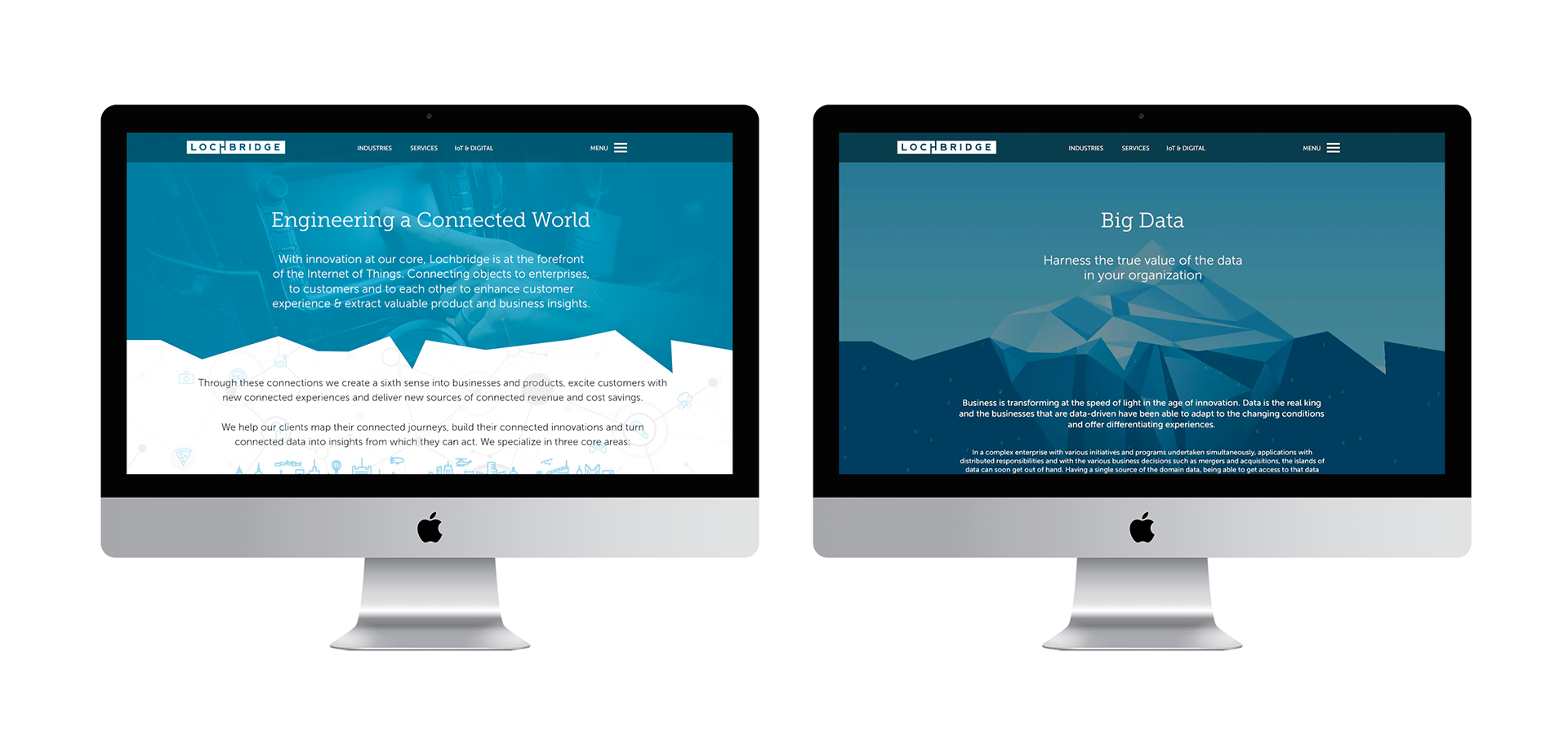
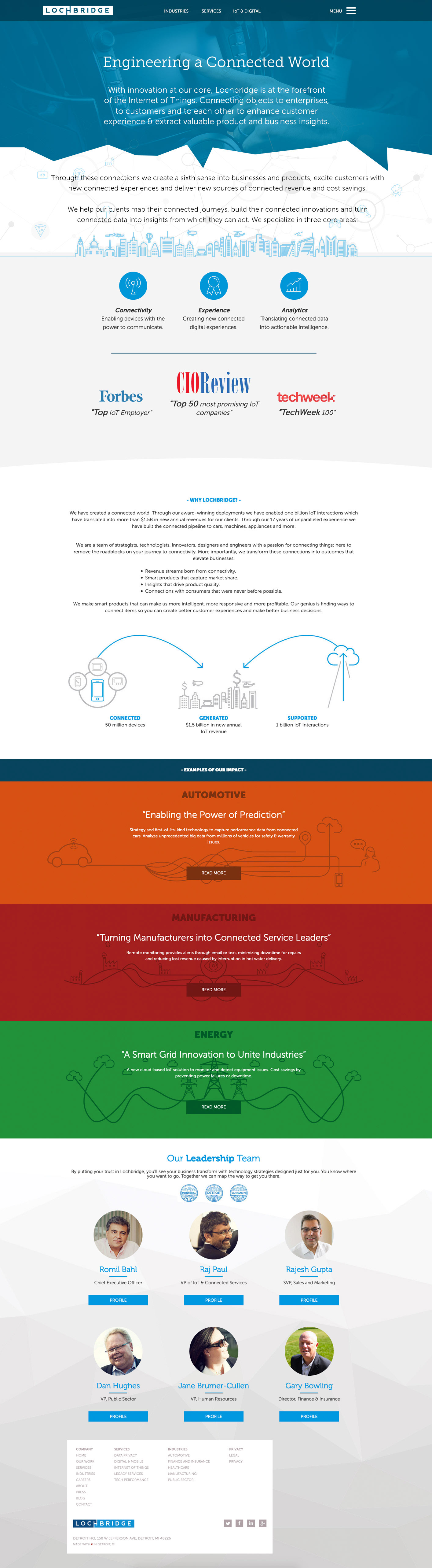
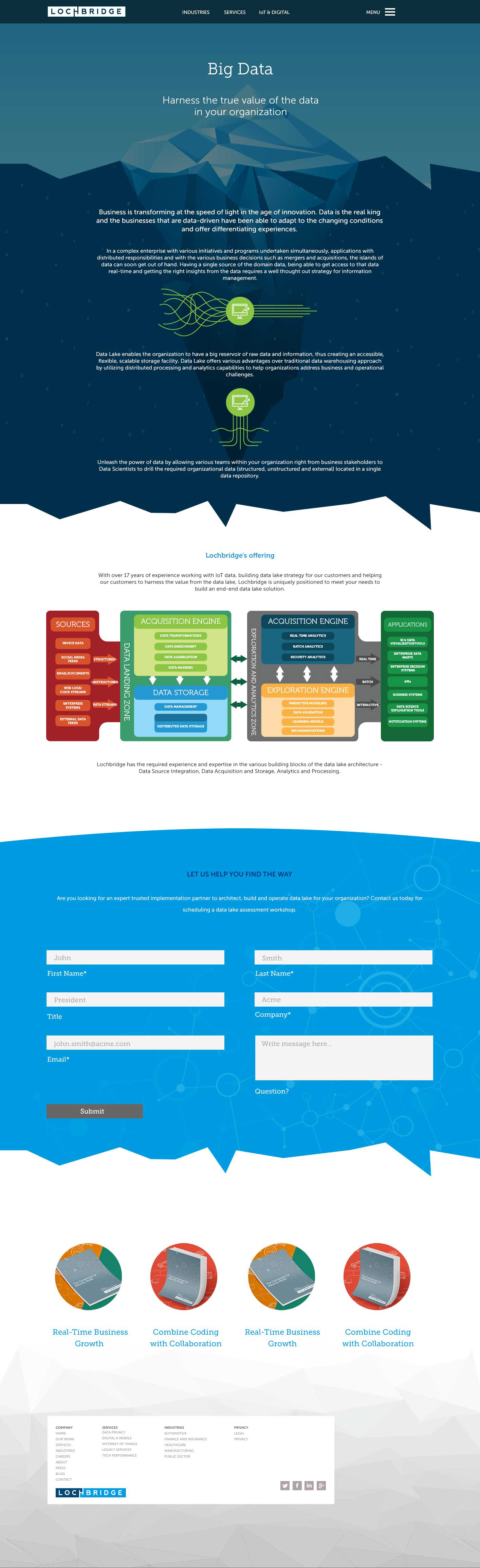
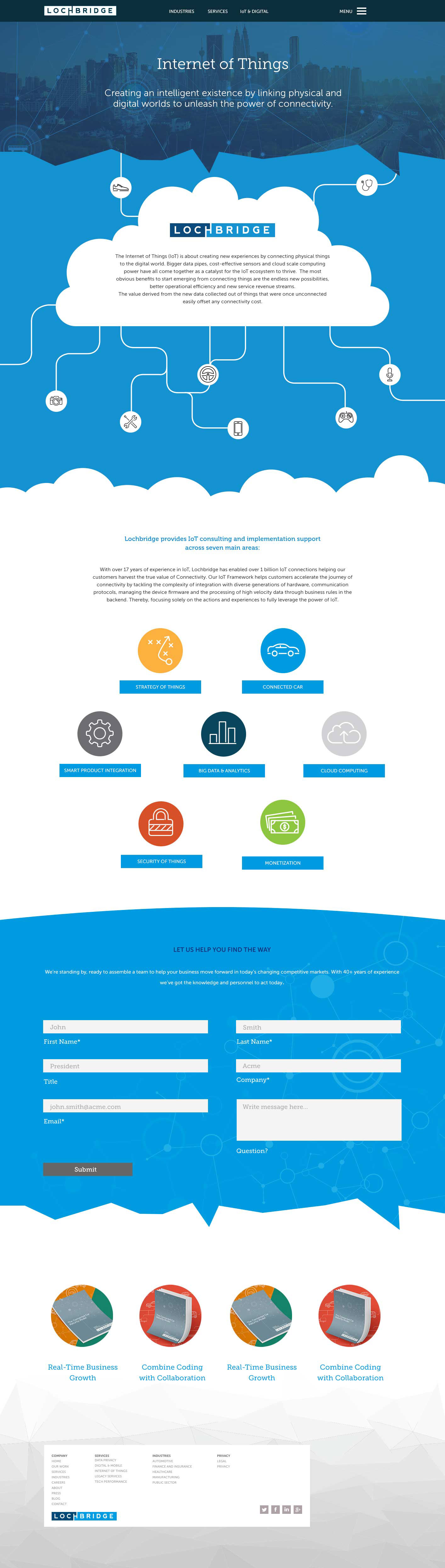
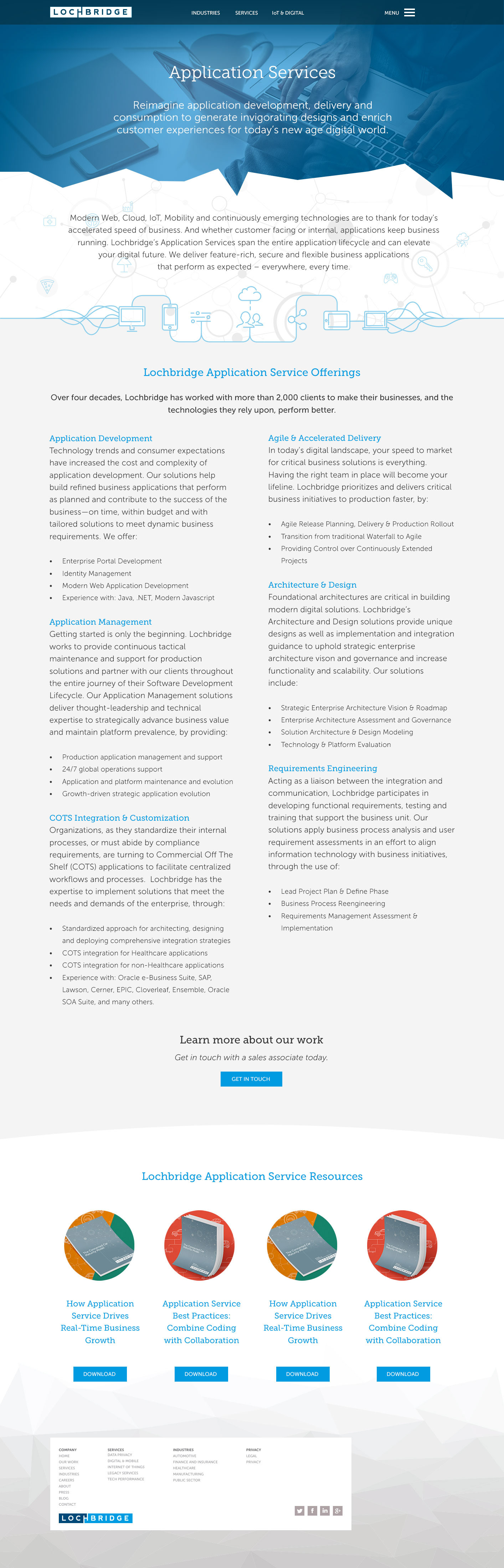
Lochbridge
Brief:
Main goal: Unclear what Lochbridge does - new site should clarify what Lochbridge works on.
Overhaul of old brand look and feel and messaging.
Break page information down to be more digestible